Log Transform
February 23rd, 2009 by PotatoI was playing around with some data analysis here at work, and decided that I’d try to do a little log transform on some stock market data. Generally, you expect the market to increase exponentially over the long term. This leads to some pretty big numbers after some time, so a chart looks something* like this:

It’s an impressive chart, however the thing about exponential growth is that after a century we’re dealing with some very large numbers. In fact, the last few decades seem to dominate the chart: the recent market crash and the tech issues in the 2000’s appear, on that chart, to be way worse than the great depression, which looks like a small blip in the 30’s down in the bottom of the range. We could of course zoom in on that region:

Showing that there was a big nasty swing in there.
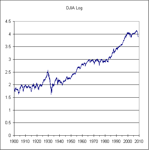
So one way to better look at data over the real long term like this is to do a log transform (in this case, I chose base 10). That takes an exponential growth curve and makes it linear. Now instead of being dollar value up the y-axis, we now have powers of 10.

This is a different way to view the data. To my eye, the long-term trends seem to stick out more, and the current crisis can be put into perspective with past issues. The stock market crash of the 30’s, from about 380 to 41 was a fall of almost 90%, or about a drop of one power of ten, which would be 1 unit on the logarithmic scale. Right now we’re down about 50%, or 0.3 on the log scale.
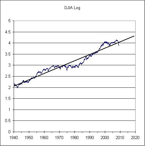
I like looking at the log plot, because it shows that over the span of multiple decades that there is some consistency to the stock market going up, and that while this recent disappointment is crushing (down another 3+% today!) it’s not totally unprecedented. It also helps restore my sanity after reading some extreme bears who point to that 100-year chart and say that the world went crazy in 1985 and everything that happened after that was crazy and volatile and that if we fit a line to the rest we’d be back down to 2000-4000 and that’s where the Dow is heading! Of course that’s really just an artifact of the magnification of exponential growth — you can’t fit a linear trend to an exponential curve (ok, for small values you can, which is exactly the error they’re making!). If you want to draw a straight line, then you should work from the log plot. While I don’t put too much faith in chart divination, I think I might have this one printed off:

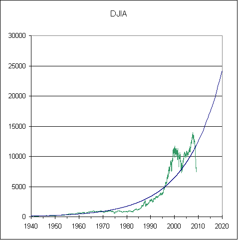
The market can underperform for a long time (the market can stay irrational longer than you can stay solvent, as the saying goes), but with a timespan of 20-30 years (when I’ll be 50-60) it should come back to that long-term trend. It doesn’t help me figure out when we’ll bottom, or when we’ll get back up, or even for sure if that’s an accurate projection of what will happen in the future, but it will help me sleep better knowing that essentially all of my net worth is subject to the whims of the market. For the curious, here’s what that same trendline looks like on the untransformed data:

Exponential growth is everywhere in nature, but I bet at least half of you are shaking your heads at that 25,000 by 2020 extrapolation! It’s just so hard to wrap your head around numbers that large, though that would only be a ~6% return per year from the peak (about 11% per year from where we are now).
* – Note, I was getting some Y2K errors with the data I have (starting from 1900 — I just did a Google search for DJIA historical data and took the first one), I think I fixed it up, but might have made some mistakes. Feel free to fix if you like. To improve on this analysis you can include dividends, inflation, and compare multiple countries (I doubt things would look as good in Japan, for example) or run a monte carlo with sample portfolios to get some confidence intervals. These are left as exercises for the reader.
Also, for those on the RSS feed, the images may not come through. Try viewing in your web browser.


 Questrade: use QPass 356624159378948
 Passiv is a tool that can connect to your Questrade account and make it easier to track and rebalance your portfolio, including the ability to make one-click trades.
February 27th, 2009 at 5:32 pm
Great post. It’s always important to look at data over long periods logarithmically.
On another subject, when I click on your orange feed button, I get dumped to a page that starts “This XML file does not appear to have any style information associated with it. The document tree is shown below” and is followed by a not very helpful document tree. I haven’t found any way to get your feed into my Google reader.
February 27th, 2009 at 5:48 pm
Ah, that’s a good question. I don’t have it set up with any of the syndicators like feedburner or delicious or what have you, but might get around to that when I have some free time.
The link is correct for now though, it’s just that it’s meant to be read by your RSS2 reader rather than your webbrowser :) I just go right-click, copy link location, then go to my feed reader (google, thunderbird, etc), click add feed, then paste the URL in.