My dad has read Atul Gawande’s Being Mortal, which discusses the suffering that people can experience near the end of their lives — particularly the suffering of medical treatments to extend those lives. There was no question about having surgery to remove his tumour — the cost-benefit there was huge (esp. as it had sent him to emerg). But he explicitly did not want to go through adjuvant chemotherapy, because chemo sucks and he knows that first hand, and he didn’t think it would have much in the way of benefits.
Then we met with the oncologist and found out that the regimen he’d have now would be much less severe than the kind of chemo he had a decade ago, and that the benefits were very real.
But exactly how to convey those benefits is a tricky matter. She told us, roughly speaking, that 50% of people with his kind of cancer would still be alive and cancer-free 5 years out — the surgery alone totally cured them, and taking chemo would be a pain in the rear but not actually help them because they were cured already. 20% of people would have had their disease come back, but not with chemo, while 30% would see their disease come back regardless of chemo. So, a 20 percentage point increase in chances, chemo sounded pretty good.
But it’s hard to frame that in a way that sticks. After hitting the first wall in chemo side effects, “20%” didn’t sound that great any more. So my dad wanted me to explain it to him plainly: he was giving up 6 months of his life (or at least quality of life) to chemo. What was he giving it up for? “How much longer will I live?” And I get it: he wants the benefit expressed in the same units as the cost, which would make decision-making so much easier. But the cancer stats just don’t seem to be expressed that way.
And it’s complicated: it’s not as simple as giving up 6 months, as there are probabilities and uncertainties there, like permanent adverse events, versus the probability of having a recurrence and dying (or having a much harsher round of treatment), or the probability of being cured of cancer for the rest of his life but then having a heart attack or stroke. Even if he was cancer free in 5 or 10 or 15 years, how much longer would he live otherwise? And giving up a year at 69 when he could go golf or enjoy the cottage is perhaps not worth gaining a year at 79 where he might not be having as much fun. These are all hard things to say.
Later, I found a chart that looked basically like this that helped show the survival benefit:
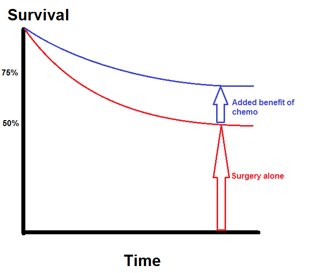
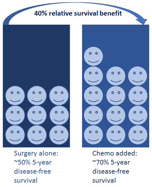
But even that is lacking, as when choosing whether or not to take chemo the percentage point increase may not be as important as the percentage increase. That is, if you’ve already got a 50% chance of survival, bumping that up to 70% is a 40% improvement in your situation — taking the chemo is better than the “20 percent” figure makes it sound.
So I made a pictograph, which I think may be a better framing for showing the benefit of chemo. The MSKCC nomogram has a similar display.
None of this really helps answer the question in the way my dad wants, with the benefit in the same units as the cost. I started to go down the road of maybe integrating under those survival curves, to try to quantify what the expected increase in lifespan was. I even went into some of the quality-adjusted life years research and found a set of results that I could use as a weighting function — after all, an extra month of good health at 69 is not quite the same as an extra month at 79 or 89. But I stopped because that’s guaranteed to be an exercise in false precision, and I’m not sure giving him what he wants there is the best way (and I’m also doubting myself because no one that I’ve seen in health science presents results in this way to patients — at most such things are used in health economics to talk about big picture costs and programs).


 Questrade: use QPass 356624159378948
 Passiv is a tool that can connect to your Questrade account and make it easier to track and rebalance your portfolio, including the ability to make one-click trades.