[Update: this post appears in the Carnival of Wealth, Dollars to Dollars Edition]
Here is how many people plan for retirement (and many similar activities that involve projections): come up with reasonable estimates of the relevant parameters. Plug it into an online calculator or spreadsheet to do the math. Have a cookie.
Yet you really can’t just say that the average investment return is 6%, your average spending needs are $40k/yr and inflation will hit 2%, plug that into a spreadsheet, and call your financial planning exercise completed. That might be your expected, most likely outcome and an excellent start. You can plot it for a nice, smooth exponential growth trajectory like this:
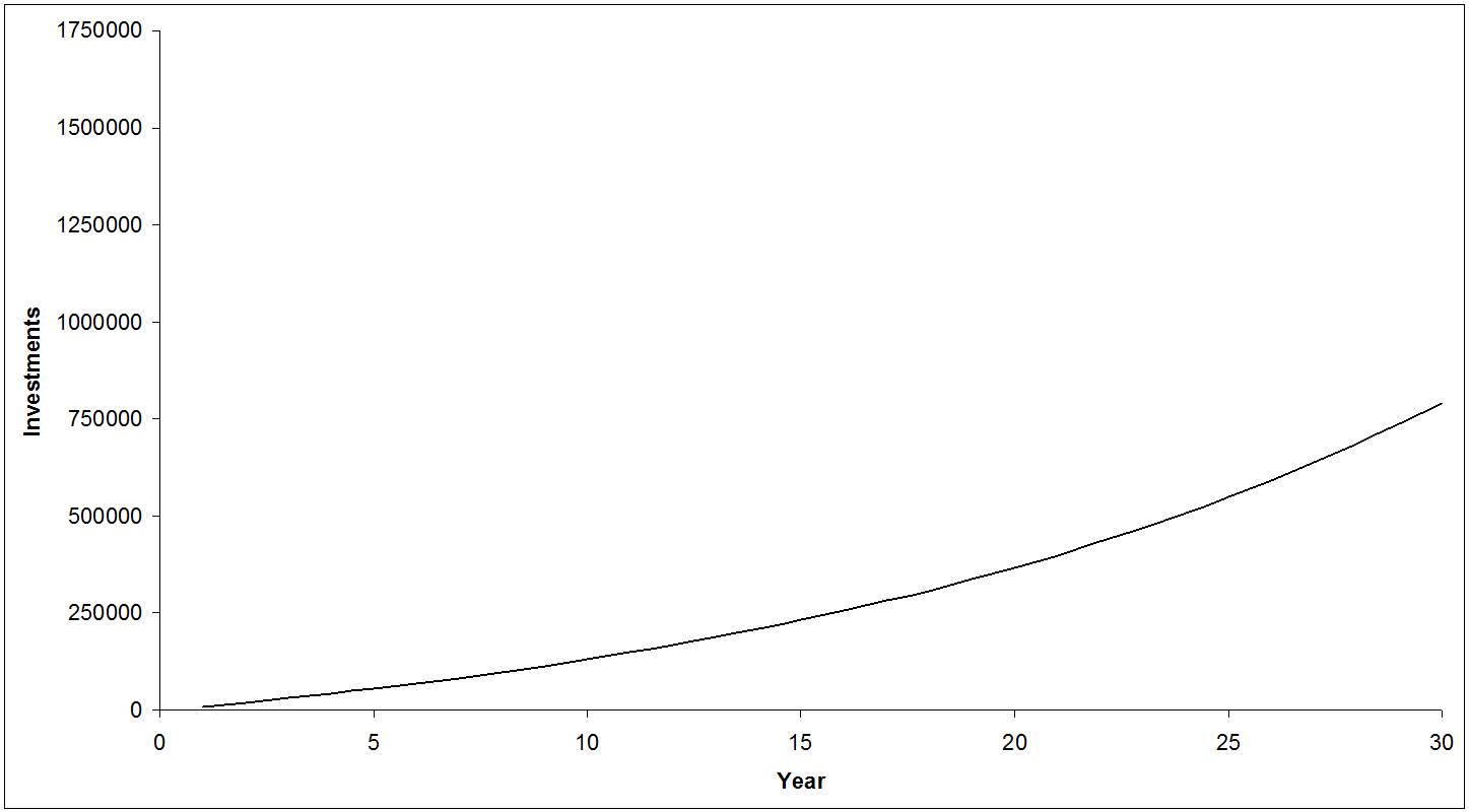
A very comforting graph: continually saving money, making steady returns, you move smoothly towards your retirement goal. While your future might have a good chance of looking something like that, it’s highly unlikely to be precisely like that. There’s a whole range of possible outcomes. So we don’t want to just plot the course that’s going to get us there. Take a few minutes and add a “95%1 best case” and “95% worst case” projection. How would those scenarios affect your plans?
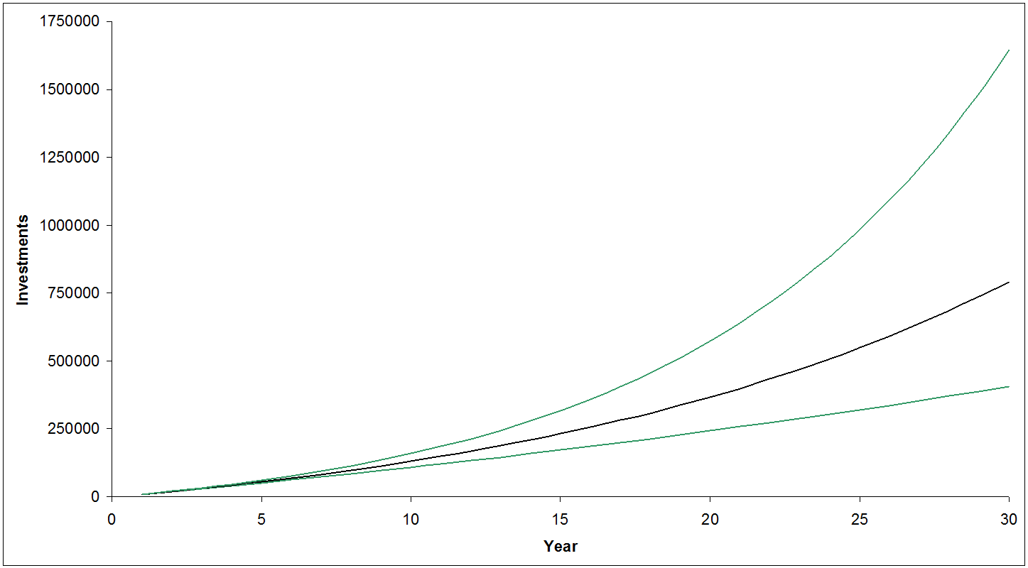
That’s a fair bit better: you have some idea of the range of future outcomes, and may even be able to say how those might compare to what you’re willing to accept, and set some limits and guidelines for your future course corrections. Maybe if by year 5 you’re closer to the bottom line than the middle one, you’ll increase your savings rate to compensate. But even that is not really capturing the uncertainty and more importantly the variability ahead. There’s a big cloud of probability around the outcomes, and this is just a small, simplified part of a projection to retirement.
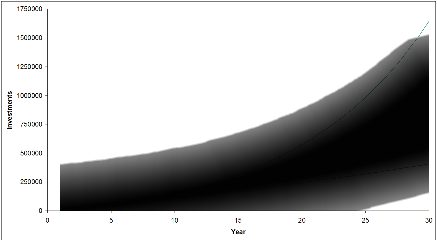
Maybe describing it as a cone of probability is a better way of putting it. This helps visualize all the uncertainty that we face going into the future. Note that I made the bottom edge creep up over time; this works with some recent posts by Michael James about stocks becoming less risky over time. Next year the market could be down 50% in a repeat of 2008, but 30 years from now it’s very likely that the market will be up. Up less than your projected 6% real return perhaps, which could be a challenge to your initial plan, but up nonetheless.
Because the future is so inherently uncertain, I generally tell people with a lot of future ahead of them to not sweat the fine details: tweaking your asset allocation to the last half a percent really won’t matter when you can only guess at future returns to plus or minus 5% CAGR over 30 years. Control what you can (keep fees low, save some decent amount of your income, start early, don’t panic), and be prepared to be surprised and make adjustments. Get started in approximately the right direction, try to keep moving in the right direction through an iterative process, and try not to fear the uncertainty. Uncertainty is a fact of life. The future will — at best — only look approximately like how we imagine it will.
That’s a tough, uncomfortable concept for many. We demand rigidly defined areas of doubt and uncertainty! The unknown is scary and foreign and weird, and people just don’t like the unknown; uncertainty looks a lot like that with some kind of math mixed in (which is frightening and uncomfortable in its own right). As terrifying as this is going to sound: you can’t hide from uncertainty. That’s just the nature of life (and if it was less uncertain it would be boring).
A plan that includes a big cone of probability and uncertainty may actually be more useful than one that pretends there is no uncertainty in the future, though the single line, ever-upwards trajectory was a lot more appealing to our baser selves.
Podcast podcast podcast! In case you missed it, we talked about these issues (and I unveiled these terrible excel/photoshop hybrids) in the because money podcast earlier in January.
Footnote: pardon me for using photoshop to make the probability clouds. I should have used MATlab or something with an actual Monte Carlo simulation, but I don’t actually have it on any of my current computers — I’d have to go fire up my ancient Pentium 3 system as it’s the only one left in the house that still has MATlab and Maple. The consequence is that the clouds are not particularly accurate, and aren’t as much like cones as I would have liked. Hopefully the visual still works for you.
1 – By which I mean in a stats sense your 95% confidence interval — or in a more plain language sense — aside from a few extreme cases, the range your results will most likely fall within.


 Questrade: use QPass 356624159378948
 Passiv is a tool that can connect to your Questrade account and make it easier to track and rebalance your portfolio, including the ability to make one-click trades.